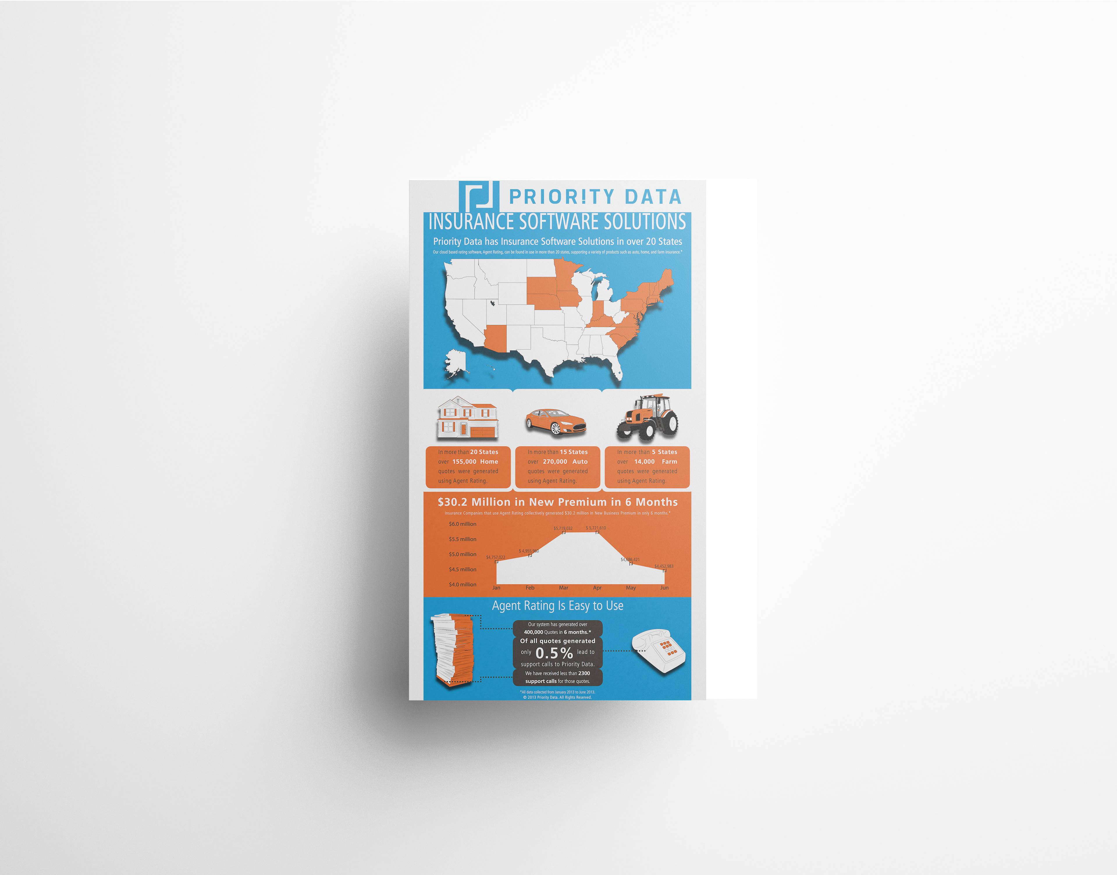

What started as simple drawings of tractors to be used in an ad, turned out to be a visual demonstration of Priority Data's growth. Both pieces display the growth and size, nationally and on a state wide level, while being easy to navigate and comprehend. Precisely what an infograph should do.